Hubie Halloween Movie Poster Quality Review Hubie Halloween – Oemiu
Hubie Halloween Movie Poster Quality Review
The movie poster serves as the initial point of contact between a film and its potential audience. It’s a visual sales pitch, a promise of what’s to come. For “Hubie Halloween,” a 2020 Netflix comedy starring Adam Sandler, the poster had a specific job: to convey the film’s family-friendly humor, its Halloween setting, and the endearing awkwardness of its protagonist. But how well did the Hubie Halloween poster succeed? Did it effectively capture the essence of the film and entice viewers to press play? This review dives deep into the various aspects of the Hubie Halloween poster, dissecting its composition, color palette, typography, and overall effectiveness in communicating the film’s message. We’ll also explore how the Hubie Halloween poster stands compared to other family-friendly Halloween movie posters, and whether it fully exploits the cinematic potential hinted at within the film itself.
Decoding the Visual Narrative: Composition and Imagery
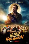
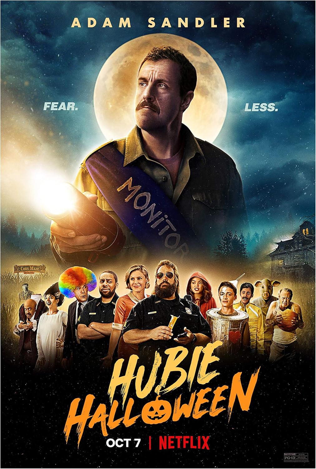
The composition of the Hubie Halloween poster is relatively straightforward, opting for a character-centric approach. Adam Sandler, as Hubie Dubois, is prominently featured, occupying a significant portion of the visual space. He’s dressed in his familiar Halloween patrol attire, complete with a thermos and a somewhat bewildered expression. The background is a slightly blurred depiction of Salem, Massachusetts, during Halloween night, complete with jack-o’-lanterns, trick-or-treaters, and a generally festive atmosphere. However, the background is intentionally soft-focused, ensuring that Hubie remains the focal point. This technique effectively draws the viewer’s attention to the main character and reinforces the film’s emphasis on his comedic journey. One potential critique, however, lies in the poster’s lack of dynamic action. While the scene sets the Halloween stage, it lacks a certain spark or element of surprise. Other posters in the genre often employ more dramatic lighting or a sense of impending chaos to create a greater sense of urgency and intrigue.
The choice of imagery is crucial in conveying the tone of the film. The jack-o’-lanterns, trick-or-treaters, and Halloween decorations immediately establish the festive setting. Hubie’s awkward yet endearing expression suggests the film’s comedic nature, hinting at his underdog status. However, a closer look reveals a slight disconnect. While the background depicts a typical Halloween celebration, there’s no real sense of danger or mystery. This might be intentional, signaling the film’s lighter, more family-friendly approach. Yet, the absence of any genuine threat or suspense could potentially deter viewers seeking a more thrilling Halloween experience. Comparing the Hubie Halloween poster to the posters of movies like “Hocus Pocus” or “The Addams Family,” which effectively blend humor with a touch of macabre, reveals a noticeable difference in the level of suspense conveyed.
The placement of secondary characters is also worth noting. While they are present in the background, they are not prominently featured. This reinforces the film’s focus on Hubie’s individual journey. However, it also misses an opportunity to showcase the ensemble cast and hint at the supporting characters’ roles in the story. A more balanced composition, incorporating key supporting characters in a more visually engaging way, could have broadened the poster’s appeal and provided a more comprehensive glimpse into the film’s narrative. Ultimately, the Hubie Halloween movie poster prioritizes character focus and thematic setting over dynamic action and ensemble representation, aligning with the film’s emphasis on Hubie’s personal story set against the backdrop of Halloween night. But how does the choice of color palette support this narrative?
Color Palette and Typography: Setting the Mood
The color palette of the Hubie Halloween movie poster leans heavily into traditional Halloween hues: oranges, blacks, and purples dominate the scene. These colors are instantly recognizable and evoke a sense of autumnal festivity. The orange glow emanating from the jack-o’-lanterns provides a warm and inviting feel, while the darker shades of black and purple add a touch of mystery and ambiance. However, the overall color scheme is relatively subdued, lacking the vibrancy and energy often associated with comedies. While the colors are appropriate for the Halloween setting, they could have been used more dynamically to enhance the film’s comedic tone. A brighter, more saturated palette might have conveyed a greater sense of fun and excitement, potentially attracting a wider audience.
The typography used for the film’s title and credits is clean and legible, opting for a sans-serif font that is easy to read. The title, “Hubie Halloween,” is prominently displayed and uses a slightly stylized font with rounded edges, further reinforcing the film’s family-friendly nature. However, the typography is not particularly distinctive or memorable. It lacks the visual flair and personality that could have helped the poster stand out from the crowd. A more creative and visually appealing font choice could have significantly enhanced the poster’s overall impact. Consider the use of fonts in posters for movies like “Ghostbusters” or “Beetlejuice,” where the typography itself becomes an integral part of the visual identity. The Hubie Halloween poster, in contrast, opts for a more conservative approach, prioritizing readability over visual innovation.
The placement of the title and credits is also strategically chosen. The title is positioned at the top of the poster, ensuring maximum visibility. The credits are placed at the bottom, in a smaller font size, ensuring that they don’t distract from the main visual elements. This arrangement is fairly standard for movie posters and effectively conveys the necessary information. However, there is room for improvement in terms of visual hierarchy. A bolder and more visually striking title treatment could have significantly enhanced the poster’s overall impact. The key to a good movie poster, especially a movie poster for Hubie Halloween, is finding the balance between information and aesthetics. The Hubie Halloween poster is functional, but it could have been more visually engaging.
In conclusion, while the color palette and typography are appropriate for the film’s theme and target audience, they lack the visual dynamism and creativity that could have elevated the poster to a higher level. A more vibrant color scheme and a more distinctive font choice could have significantly enhanced the poster’s overall impact and made it more memorable. The subtle touches, or lack thereof, in the poster’s coloring and typography ultimately contribute to the perception of the film, and in this case, the subtlety may be a detriment.
Comparative Analysis: Hubie Halloween vs. Other Family Halloween Movie Posters
To truly assess the quality of the Hubie Halloween poster, it’s essential to compare it to other family-friendly Halloween movie posters. Films like “Hocus Pocus,” “The Addams Family,” “Casper,” and even animated features like “Hotel Transylvania” offer valuable points of comparison. These posters often employ similar elements, such as Halloween imagery, prominent character placement, and a blend of humor and suspense. However, they also differ in their execution, offering different approaches to visual storytelling. Looking at the “Hocus Pocus” poster, we see a dynamic composition with the Sanderson sisters front and center, surrounded by swirling smoke and a sense of mischievous energy. The color palette is vibrant and eye-catching, while the typography is playful and memorable. In contrast, the Hubie Halloween poster feels relatively static and subdued.
Similarly, “The Addams Family” poster effectively blends humor with a touch of macabre. The characters are portrayed in their iconic poses, with a dark and gothic background that reinforces the film’s unique tone. The poster creates a sense of intrigue and mystery, hinting at the film’s quirky and unconventional humor. The Hubie Halloween poster, while showcasing the Halloween setting, lacks this element of intrigue. It presents a more straightforward and less visually stimulating image. Even a movie like “Casper,” marketed towards children, has a visually engaging poster showing Casper and his friends in a fun, mischievous setting, which is something that the Hubie Halloween poster lacks. This missing element, while perhaps meant to convey the simple nature of the movie, may be a missed opportunity.
| Feature | Hubie Halloween Poster | Hocus Pocus Poster | The Addams Family Poster |
|---|---|---|---|
| Composition | Character-centric, static | Dynamic, ensemble-focused | Iconic poses, gothic background |
| Color Palette | Subdued oranges, blacks, and purples | Vibrant and eye-catching | Dark and gothic |
| Typography | Clean and legible, but not distinctive | Playful and memorable | Unique and fitting for the theme |
| Overall Tone | Family-friendly, comedic | Mischievous, energetic | Quirky, macabre |
The animated posters, like those for “Hotel Transylvania,” often utilize bright and exaggerated visuals to appeal to a younger audience. They are typically filled with energy and movement, showcasing the characters in dynamic poses and highlighting the film’s comedic elements. While the Hubie Halloween poster is not animated, it could have benefited from a more dynamic and visually engaging composition. The Hubie Halloween Netflix movie aimed for a wider audience, and a poster that reflected that would have been more successful. The key takeaway from this comparative analysis is that while the Hubie Halloween poster is not inherently bad, it could have been significantly improved by incorporating elements from other successful family Halloween movie posters. A more dynamic composition, a more vibrant color palette, and a more distinctive typography could have elevated the poster to a higher level and made it more memorable.
Long-Tail Variations and Search Engine Optimization
While the primary focus of this review is on the aesthetic and artistic qualities of the Hubie Halloween movie poster, it’s also important to consider its search engine optimization (SEO) potential. In today’s digital landscape, online visibility is crucial for any film, and the poster serves as a key element in attracting potential viewers through search engines. Long-tail keywords, which are longer and more specific search phrases, can be particularly effective in targeting niche audiences and driving organic traffic. Some examples of long-tail keywords related to Hubie Halloween include “Hubie Halloween movie poster analysis,” “Hubie Halloween poster design review,” “Adam Sandler Hubie Halloween poster quality,” “family Halloween movie poster comparisons,” “Hubie Halloween poster vs Hocus Pocus poster,” and “best Halloween movie posters for families.” These long-tail keywords allow users who are actively searching for information about the Hubie Halloween poster or related topics to easily find relevant content. The Hubie Halloween movie is very popular, so SEO is important.
To maximize the SEO potential of the Hubie Halloween poster, it’s important to optimize the image file itself. This includes using descriptive file names, adding alt text to the image, and ensuring that the image is properly sized and compressed for web use. The alt text should accurately describe the content of the image and include relevant keywords. For example, the alt text for the Hubie Halloween poster could be “Hubie Halloween movie poster featuring Adam Sandler as Hubie Dubois.” The image file name should also be descriptive and include relevant keywords. For example, the file name could be “hubie-halloween-movie-poster.jpg.” Optimizing the image file itself is a crucial step in improving its visibility in search engine results.
Furthermore, incorporating the Hubie Halloween poster into blog posts, articles, and social media content can further enhance its SEO potential. By creating high-quality content that is relevant to the Hubie Halloween poster and its themes, you can attract organic traffic and increase its visibility in search engine results. This content should be well-written, informative, and engaging, and it should naturally incorporate relevant keywords. For example, a blog post comparing the Hubie Halloween poster to other family Halloween movie posters could attract a significant amount of organic traffic from users searching for information about Halloween movie posters. Remember, the movie poster for Hubie Halloween, or any movie, is an advertisement and should be treated as such when optimizing its presence online.
In summary, while the Hubie Halloween poster may not be a masterpiece of visual design, it can still be effectively used to drive organic traffic and attract potential viewers through search engine optimization. By optimizing the image file, incorporating relevant keywords, and creating high-quality content, you can significantly improve its visibility in search engine results and reach a wider audience interested in the Hubie Halloween film. The more ways you can get the Hubie Halloween movie poster in front of a target audience, the more successful it will be.
FAQ
What is the primary purpose of a movie poster?
The primary purpose of a movie poster is to attract potential viewers and convince them to watch the film. It serves as a visual advertisement that communicates the film’s genre, tone, and key themes. A well-designed movie poster can pique the interest of the target audience, create anticipation, and ultimately drive ticket sales or streaming views. The poster acts as the first impression, setting the stage for the cinematic experience. It needs to be eye-catching and memorable, capturing the essence of the movie in a single image. Furthermore, it must convey essential information such as the title, cast, and release date, ensuring that potential viewers can easily identify and locate the film.
How important is the color palette in a movie poster’s effectiveness?
The color palette is extremely important in a movie poster’s effectiveness. Colors evoke emotions and associations, and a carefully chosen color palette can significantly enhance the poster’s ability to communicate the film’s tone and genre. For example, a horror movie poster might use dark and ominous colors like blacks, reds, and greens to create a sense of fear and suspense. A romantic comedy poster, on the other hand, might use brighter and more cheerful colors like pinks, yellows, and blues to convey a sense of warmth and happiness. The color palette should also be visually appealing and harmonious, creating a balanced and aesthetically pleasing image that attracts the viewer’s attention. A poorly chosen color palette can make a poster look amateurish or unappealing, potentially deterring potential viewers.
What role does typography play in a movie poster?
Typography plays a crucial role in a movie poster. It is responsible for conveying the film’s title, tagline, and other essential information in a clear and visually appealing manner. The font choice, size, and placement can significantly impact the poster’s overall impact and readability. A well-chosen font can enhance the poster’s aesthetic appeal and reinforce the film’s genre and tone. For example, a horror movie poster might use a jagged and unsettling font to create a sense of unease, while a historical drama poster might use a classic and elegant font to convey a sense of sophistication. The typography should also be legible from a distance, ensuring that potential viewers can easily read the title and other key information. A poorly chosen font can make a poster look cluttered or unprofessional, potentially detracting from its overall effectiveness.
How can a movie poster incorporate long-tail keywords for SEO purposes?
A movie poster can indirectly incorporate long-tail keywords for SEO purposes by being associated with optimized content online. While the poster image itself cannot directly contain text-based long-tail keywords, the surrounding text and context on websites and social media platforms where the poster is displayed can be optimized. This includes using descriptive file names for the poster image, adding alt text that incorporates relevant keywords, and writing blog posts or articles that discuss the poster and its design in detail. For example, a blog post analyzing the color palette of the Hubie Halloween movie poster could target long-tail keywords such as “Hubie Halloween poster color analysis” or “best Halloween movie poster color schemes.” The key is to create high-quality content that is relevant to the poster and its themes, and to naturally incorporate relevant keywords into the text.
What are some common mistakes to avoid when designing a movie poster?
Is it important to hire a professional graphic designer?
There are several common mistakes to avoid when designing a movie poster. One common mistake is overcrowding the poster with too much information, making it look cluttered and confusing. Another mistake is using a font that is difficult to read or inappropriate for the film’s genre. It is also important to avoid using low-resolution images or poorly executed graphics, as this can make the poster look amateurish and unprofessional. Additionally, it is essential to consider the target audience and design the poster in a way that appeals to their tastes and preferences. A well-designed movie poster should be visually appealing, easy to read, and effectively communicate the film’s essence. And yes, hiring a professional graphic designer will help with these, as professionals know how to avoid those pitfalls.
How does the rise of digital streaming services affect the importance of movie posters?
The rise of digital streaming services has undeniably altered the landscape of movie marketing, but it hasn’t diminished the importance of movie posters. While physical posters may be less prevalent in theaters, their digital counterparts are more crucial than ever. Streaming platforms heavily rely on thumbnail images, which are essentially miniature movie posters, to capture viewers’ attention. These digital posters appear on streaming menus, recommendation lists, and social media feeds, acting as the primary visual hook that entices users to explore a particular film. In fact, in some ways, the digital poster’s importance has increased. Given the amount of choices available through streaming, movies need something to get the viewer’s attention quickly, and the poster needs to stand out among a crowd.
What makes a movie poster “iconic”?
A movie poster becomes “iconic” when it transcends its original purpose as a mere advertisement and becomes a cultural symbol. This often happens when the poster captures the essence of a film so perfectly that it becomes instantly recognizable and evokes strong emotions in viewers. Iconic posters often feature memorable imagery, striking compositions, and distinctive typography that sets them apart from other movie posters. They may also become iconic due to their association with a particularly popular or influential film. The Hubie Halloween poster doesn’t necessarily fit that definition, and may be more functional than iconic. For example, the “Jaws” poster, with its iconic image of a shark ascending towards a swimmer, is instantly recognizable and evokes a sense of terror and suspense. Similarly, the “Star Wars” poster, with its dynamic composition and heroic imagery, is a cultural touchstone that represents the epic scope and adventure of the film. Iconic posters are often reproduced on merchandise, displayed in art galleries, and referenced in other forms of media, solidifying their place in popular culture. Ultimately, a movie poster achieves iconic status when it becomes more than just an advertisement and evolves into a lasting symbol of the film and its impact on society.
Price: $27.99
(as of Sep 11, 2025 12:03:03 UTC – Details)